TWIG TALK

TWIG TALK

VISUAL IDENTITY GUIDE — TWIG TALK 2027

VISUAL IDENTITY GUIDE — TWIG TALK 2027

Ariel shot of the courts

OBJECTIVE

OBJECTIVE

Blur action shot of sneakers on a pickleball court

This guide gathers the essentials for creating materials aligned with the Twig Talk 2027 identity. It serves the team, designers and vendors in making consistent decisions.

This guide gathers the essentials for creating materials aligned with the Twig Talk 2027 identity. It serves the team, designers and vendors in making consistent decisions.

Each block leads to its section. More than reproducing graphics, the goal is to apply the event's visual universe with coherence.

CONCEPT

Blur action shot of sneakers on a pickleball court

WHAT IS TWIG TALK?

WHAT IS TWIG TALK?

Twig Talk is the Twig community's main in-person gathering. It is an international experience that combines business, hospitality, conviviality and lifestyle. The event should be perceived as a temporary club formed by a permanent community.

Twig Talk is the Twig community's main in-person gathering. It is an international experience that combines business, hospitality, conviviality and lifestyle. The event should be perceived as a temporary club formed by a permanent community.

TWIG TALK IS NOT+

A LOGISTICS TRADE SHOW · A TRADITIONAL CORPORATE CONFERENCE · A TOURISM CAMPAIGN · A GENERIC TROPICAL PARTY · A LITERAL SPORTS EVENT · EXCESSIVE LUXURY

Tennis, golf, sailing and clubs are references of repertoire, not decorative themes.

TWIG TALK IS NOT+

A LOGISTICS TRADE SHOW · A TRADITIONAL CORPORATE CONFERENCE · A TOURISM CAMPAIGN · A GENERIC TROPICAL PARTY · A LITERAL SPORTS EVENT · EXCESSIVE LUXURY

Tennis, golf, sailing and clubs are references of repertoire, not decorative themes.

POSITIONING

Twig Talk 2027 comes close to a contemporary private members club — a balance between extremes, never a single side.

Twig Talk 2027 comes close to a contemporary private members club — a balance between extremes, never a single side.

Twig Talk 2027 comes close to a contemporary private members club — a balance between extremes, never a single side.

SOPHISTICATED
RELAXED
EXCLUSIVE
WELCOMING
ORGANIZED
SPONTANEOUS
PREMIUM
WITHOUT OSTENTATION

PERSONALITY

RESTRAINEDEDITORIALELEGANTHUMANINTERNATIONALCONTEMPORARYWELCOMINGCLEARSLIGHTLY NOSTALGIC

DESIRED SENSATIONS

SENSAÇÕES

DESEJADAS

BELONGINGDESIRE TO PARTICIPATESOPHISTICATIONCLOSENESSTRUSTSUMMERDISCOVERYAUTHENTICITY
  • Club

    Club

  • ·

    ·

  • Belonging

    Belonging

  • ·

    ·

  • Quiet Luxury

    Quiet Luxury

  • ·

    ·

  • Summer

    Summer

  • ·

    ·

  • Curated

    Curated

  • ·

    ·

REFERENTIAL UNIVERSE

UNIVERSO

REFERENCIAL

UNIVERSO

REFERENCIAL

VISUAL

DNA

01
Restraint
Premium perception comes from scale, breathing room, materials, photography and finishing. Never from excess effects.
02
Lifestyle before event
Pieces may look like magazine pages, travel photos or hotel objects before looking like conference material.
03
Editorial before promotional
Even commercial pieces spark desire through image and atmosphere before presenting information.
04
Atmosphere before decoration
Photography, light, texture, color and negative space build the identity. There is no need to fill.
05
Objects tell stories
A key signals access; binoculars, discovery; a cap left on the boat, presence.
06
Controlled imperfection
Crops, shadows, folds, grain and small misalignments make the identity more human.
Blur action shot of sneakers on a pickleball court

LOGOS

LOGOS

FOUR VERSIONS, ONE SYSTEM

FOUR VERSIONS, ONE SYSTEM

FOUR VERSIONS, ONE SYSTEM

The choice depends on three things: available space, production technique and composition hierarchy. When the typographic intervention is already the protagonist, the logo steps back. When the brand needs to present itself alone, it steps forward.

The choice depends on three things: available space, production technique and composition hierarchy. When the typographic intervention is already the protagonist, the logo steps back. When the brand needs to present itself alone, it steps forward.

HORIZONTAL
HORIZONTAL
The most functional of the four. It works in silence: it fits anywhere and never competes for attention. Use in: headers, platforms, interfaces, wristbands, small engravings, reduced areas, production-limited applications, and pieces that already feature a word in Luxurious Script. Usar em: headers, plataformas, interfaces, pulseiras, gravações pequenas, áreas reduzidas, aplicações com limitação de produção, e peças que já tragam uma palavra em Luxurious Script.
Download
HORIZONTAL
HORIZONTAL
A mais funcional das quatro. É a que trabalha em silêncio: cabe em qualquer lugar e nunca disputa atenção. Usar em: headers, plataformas, interfaces, pulseiras, gravações pequenas, áreas reduzidas, aplicações com limitação de produção, e peças que já tragam uma palavra em Luxurious Script.
Download

TIPOGRAPHY

TIPOGRAFIA

Aa
Bricolage Grotesque
Primary typeface used across all communications.
RegularMediumBold
Download Font
Aa
Luxurious Script
Accent typeface used to highlight selected words.
RegularAccentDisplay
Download Font
Aa
Bricolage Grotesque
Primary typeface used across all communications.
RegularMediumBold
Download Font
Aa
Luxurious Script
Accent typeface used to highlight selected words.
RegularAccentDisplay
Download Font
Type a word or phrase to test.
Wherethebestbelong
Script: 0Click once to apply Luxurious Script to the first letter; click again to apply the font to the whole word.

COLORS

COLORS

Anchor Dark Green #295A3D
Complementary Beige #FEFAE7
Support Light Green #DFF478
Support Lilac #E2D1F1
Anchor Dark Green #295A3D
Complementary Beige #FEFAE7
Support Light Green #DFF478
Support Lilac #E2D1F1

COMBINATIONS

AA
AA
AA
AA
AA
AA
AA
AA
AA
AA
AA
AA
AA
AA
AA
AA

COMPOSIÇÃO

COMPOSIÇÃO

TITLE CROSSES
TITLE CROSSES
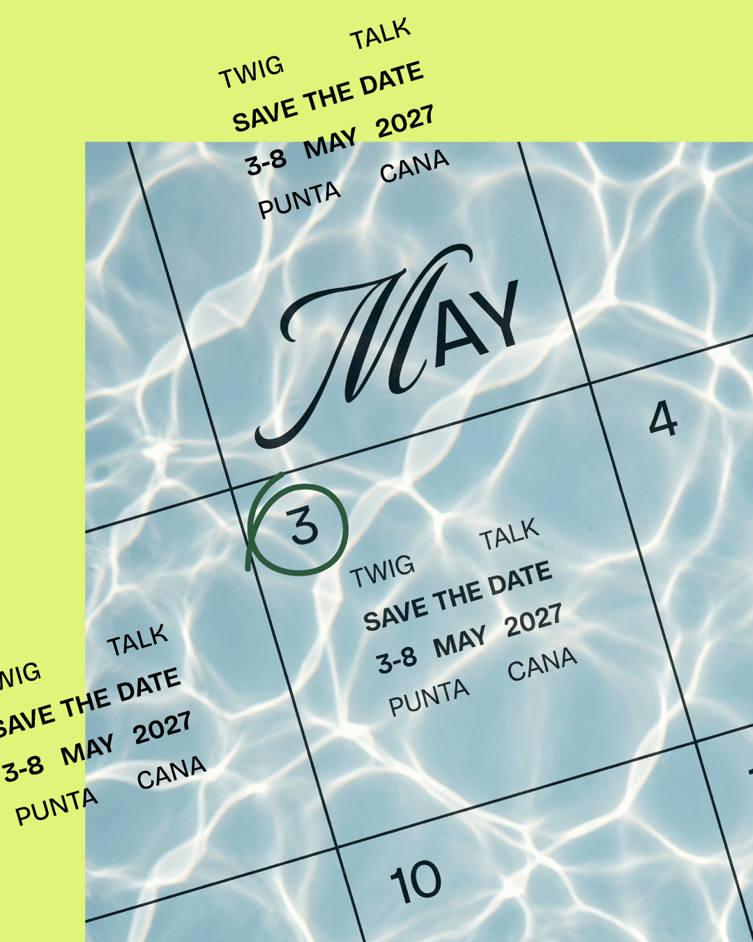
The title extends over the photo and beyond the margin.
STRAIGHT CORNERS
STRAIGHT CORNERS
Photographs always with straight corners.
NEGATIVE SPACE
NEGATIVE SPACE
Few pieces of information, plenty of breathing room.
CONTROLLED ASYMMETRY
Displaced composition, never centered.

LANGUAGE

LINGUAGEM

The graphic language is the set of elements that organizes and connects information without stealing the scene: thin lines, clean-stroke icons and printed illustrations. They are support resources — they structure, signal and add texture, always at the service of photography and text, never competing with them.

The graphic language is the set of elements that organizes and connects information without stealing the scene: thin lines, clean-stroke icons and printed illustrations. They are support resources — they structure, signal and add texture, always at the service of photography and text, never competing with them.

Lines
Thin lines divide information, structure lists and connect content. Recurring application: one piece of information at each end.
Punta Cana3–8 May 2027
Live AquaRep. Dominicana
Icons
Google Material Design or equivalents. Thin strokes, simple shapes, straight geometry and immediate readability. Avoid 3D, caricatured or overly rounded icons.
See icons on Google →
searchcalendar_monthlocation_onkeyexploresailingarrow_forward
Illustrations
Vintage and retro aesthetic — screen printing, old posters, hotel souvenirs, travel posters. Few colors, flat areas, ink texture, printed appearance. Avoid artificial retro filters, excessive grunge and childish aesthetics.

ART DIRECTION

DIREÇÃO DE ARTE

Art direction defines how the brand sees the world. Photography should look editorial, spontaneous and lived-in — scenes that seem found, not staged. Natural light, desaturated tones, shadows and grain build the atmosphere; people appear in real situations, never posing; and each object enters in context, telling a small story. The image comes before the graphic: it is what makes you feel belonging, closeness and summer.

Art direction defines how the brand sees the world. Photography should look editorial, spontaneous and lived-in — scenes that seem found, not staged. Natural light, desaturated tones, shadows and grain build the atmosphere; people appear in real situations, never posing; and each object enters in context, telling a small story. The image comes before the graphic: it is what makes you feel belonging, closeness and summer.

PHOTOGRAPHY
01
PHOTOGRAPHY
Editorial, spontaneous, lived-in. Natural light, grain, present shadows.
ENVIRONMENT
02
ENVIRONMENT
Sea, pool and palm trees as atmosphere — never a tourist cliché.
PEOPLE
03
PEOPLE
Conversations, profiles, from behind, hands. Never looking at the camera.
CLOTHING
04
CLOTHING
Linen, cotton, polos, resort wear. Official palette or natural tones.
OBJECTS
05
OBJECTS
In context: a cap on the boat, a key on the towel, a glass by the pool.
LIGHT AND TEXTURE
06
LIGHT AND TEXTURE
Vegetation shadows, water reflections, light passing through fabrics.
Prioritize
Less saturated tones
Slightly warm temperature
Moderate contrast
Present shadows, soft blacks
Subtle grain and natural light
Asymmetric framings
Plenty of negative space
Avoid
×HDR
×Saturated tourist colors
×Excessive digital sharpness
×Stock-image aesthetics
×Overly perfect scenes
×People looking at the camera
×Corporate poses

MATERIAIS

MATERIAIS

WOOD
WOOD
Light, matte, natural, with visible texture.
STONE
STONE
Beige marble, travertine, limestone. Matte and light.
METALS
METALS
Matte gold and brass, matte black, brushed steel.
FABRICS
FABRICS
Linen, cotton, canvas, twill. Visible weave, striped.
PAPER
PAPER
Uncoated, textured, visible fiber, warm white.
ROPES
ROPES
Nautical and natural fibers, light and neutral tones.
Objects of the universe
Hotel keys and tagsCapsTowelsSunglassesCamerasBooks and magazinesBinocularsCanvas luggage and bags Glasses and gobletsBoats, sails and ropesSigns, flags and keychainsParasols and pool objects
Furniture
Furniture
Lounge chairs
Wooden or woven chairs
Light sofas
Low armchairs
Stone tables
Umbrellas
Decks
Landscaping
Landscaping
Palm and coconut trees
Tropical vegetation
Light sand
Lawns
Natural shadows
Plants integrated into the space

CHECKLIST

CHECKLIST

Blur action shot of sneakers on a pickleball court
Before approving0 / 15
01Does it feel like it belongs to a contemporary club?
02Is the piece editorial, and not overly promotional?
03Does the title have prominence?
04Is there enough negative space?
05Does Luxurious Script appear in at most three words?
06Is the chosen logo appropriate to the context?
07Do the colors belong to the official palette?
08Does the photography look spontaneous?
09Do the people avoid looking at the camera?
10Does the image have shadows, texture and depth?
11Do the objects help tell a story?
12Do the materials look natural and predominantly matte?
13Does the composition avoid unnecessary decorative effects?
14Do the images have straight corners?
15If the logo were removed, would the piece still feel part of the Twig Talk 2027 universe?